Discovery & Diagnostics


"Unleashed Technologies stands out as one of the best teams I’ve ever worked with."
Jennifer Brereton, Director of Marketing
Binswanger Glass
We help our clients build custom websites, software and applications that solve their most pressing challenges and unleash their potential.

By building a custom Symfony platform, BSN streamlined ordering, increased its sales efficiency, improved order accuracy, and created a 3D product preview platform that improved customer engagement and satisfaction. Built in partnership with SensioLabs.
View project
With a global network of nearly 3,000 individual members from more than 1,150 companies, GEAPS is highly focused on improving the lives of their membership. That focus was the center of this website redesign.
View projectWebsites and applications focused on new member sign-ups, increased subscribers, easy content discovery & distribution, and clear communication.
Websites and applications that manage huge inventories, offer customer accounts, sync with ERP and CRM systems, and make the customer ordering experience easy.
Websites and applications centered on security, privacy, data complex integrations, customer engagement and accessibility.
Websites and applications focused on enrollment, alumni engagement, easy content updates and storytelling.
Websites and applications focused on donor engagement, storytelling, volunteer recruitment and easy navigation.
Websites and applications focused on patient engagement, easy content discovery, building trust, and and helping patients find the right doctor for them.
With 30+ certifications on staff, Unleashed is built on a foundation of knowledge. We are committed to a culture of collaboration and mentoring that allows our team members – whether they are accomplished veterans or still in college – to learn from each other, push each other, and feel empowered to become the best versions of themselves.
Through resource sharing, internal training, and mentoring programs, the Unleashed team built their knowledge through our collaborative environment where team members from all areas of expertise – back-end, front-end, PHP, Drupal, WordPress, SEO, JavaScript, Symfony, Magento, Acquia, HubSpot, Google Analytics, etc. – engage and grow.


We aim to explore the characteristics of exceptional open-source eCommerce websites.
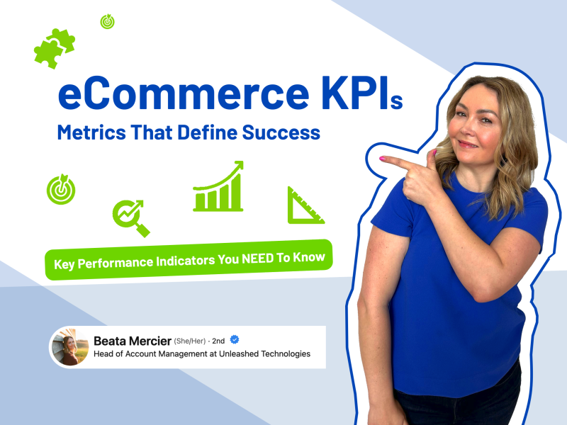
Read MoreeCommerce Key Performance Indicators (KPIs) play a pivotal role in driving revenue and optimizing conversion rates.
Read MoreFrom design to optimization, we share essential steps and expert tips for a successful eCommerce website development.
Read More
"Unleashed Technologies stands out as one of the best teams I’ve ever worked with."